Go-to-Market · July 19, 2026

Pretty website. Dead conversions. Why?

Aesthetics can earn attention. Conversion requires comprehension, trust, and a clear next step-here is how to design for decisions, not decoration.

Pretty website. Dead conversions. Why?

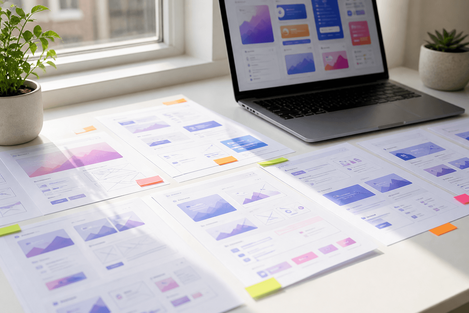
Beautiful websites win awards and screenshots. Converting websites win customers. The gap between the two is where many startups quietly lose money-while congratulating themselves on the gradient. I say this as someone who cares deeply about craft. Polish is not the enemy. Polish without an argument is.

The pattern is familiar: a redesigned homepage ships, LinkedIn applauds, bounce stays high, demos stay flat, and the team concludes they need “more traffic.” Sometimes they do. Often they need a better decision environment. Pretty is not the same as persuasive. If your site looks expensive and still under-converts, this is the playbook I use before anyone touches another animation.

Why beauty fools smart teams

Beauty is legible progress. You can screenshot it. You can present it. Stakeholders can agree it “feels premium.” Conversion is messier. It lives in comprehension, risk reduction, and the courage of a single next step. Teams optimise for the meeting, not the cold visitor. That is human. It is also expensive.

Baymard Institute’s research on e-commerce UX keeps finding the same theme in a different category: visual appeal does not rescue unclear information architecture or weak product pages-see Baymard’s blog. Startup marketing sites are not carts, but the psychology rhymes. Users need to understand, trust, and act. Aesthetics can support all three. They cannot replace them.

What conversion needs that beauty cannot fake

1. Immediate relevance

A visitor arrives with a private question: is this for me? Your hero has about ten seconds to answer. I cover that window in why startup websites fail in the first 10 seconds. Abstract taglines (“reimagine workflows”) fail the test. Specific outcomes for a specific customer pass it. Apple’s product pages often lead with capability in plain language, then let the photography earn desire. The order matters: meaning first, mood second.

2. A concrete outcome

Conversion rises when the visitor can picture a before and after. “AI-powered platform” is a category shrug. “Turn support tickets into resolved answers in one inbox your team already uses” is an outcome. Notion and Linear both sell a felt change in how work feels day to day-not a list of modules. Your copy should survive a sceptical read from someone who has been burned by software before.

3. Proof that reduces risk

Beauty without proof asks for trust on aesthetics alone. Place logos, metrics, quotes, and demos next to the claims that need belief-not in a graveyard footer. First Round Review’s company stories often show how trust compounds when proof is specific; browse First Round Review. Vague “trusted by innovators” lines are decorative. Named outcomes are persuasive.

4. One obvious next action

Competing CTAs are a design smell: Book demo, Start free, Watch video, Explore platform, Download whitepaper-all above the fold. You are outsourcing the decision to a tired human. Pick the primary action for the primary ICP. Secondary paths can exist; they should not shout equally. Nielsen Norman Group’s guidance on attention and action design is a useful external check-NN/g.

5. Speed and accessibility

A gorgeous site that takes four seconds to become interactive teaches visitors that you do not respect their time. Core Web Vitals are not a vanity engineering score; they are part of the offer. Read web.dev vitals and the broader web.dev guidance. Accessibility is the same story: if keyboard users and screen-reader users cannot complete the path, your conversion math is fictional. Start from WCAG.

Beautiful signalConversion questionFix if broken
Custom illustration heroDo I know what this product does?Lead with outcome sentence, then visual
Cinematic motionCan I act before the animation finishes?Prioritise content and CTA availability
Dense feature gridWhich path is for me?One primary CTA; progressive disclosure
Premium typographyDo I believe the claim?Put proof beside the claim

A fictional teardown: auraflow’s award-bait homepage

AuraFlow is a fictional analytics tool for DTC brands. Their redesign uses a full-bleed gradient, a floating 3D chart, and the line “Intelligence, elevated.” Bounce rate rises. Paid social “works” only when the ad explains what the homepage refuses to say. Sales sends a PDF because the site cannot close the loop. The design team is confused: every stakeholder loved the Figma file.

The fix is not uglier design. It is decision design. New hero: “See which campaigns actually pay back-updated hourly for Shopify brands doing £50k-£500k a month.” Primary CTA: Start free analysis. Proof: three brand logos and a one-line metric. The 3D chart can stay, demoted below comprehension. Within a sprint, demo requests rise without buying more traffic. The site stopped performing for Dribbble and started performing for buyers.

This is the same clarity stack I describe in your product doesn’t have a marketing problem and the practical changes in three website changes that can double conversion.

Design for decisions, not decoration

I treat websites as decision environments. Motion, imagery, and layout should guide belief-not compete with it. Beauty becomes useful when it makes the offer feel inevitable. It becomes harmful when it makes the screenshot feel expensive and the offer feel vague.

  1. Map the belief gaps: what must a visitor believe before they click?
  2. Assign each section a job: claim, proof, objection, or action-never “brand moment” alone.
  3. Write the page in plain text first. If the argument fails in a Google Doc, Figma will not save it.
  4. Only then design hierarchy, imagery, and motion as emphasis-not as the message.
  5. Test with cold readers: can they say who it is for, what changes, and what to do next?

That sequence is why I often start projects without opening design tools-explained in why I start every project without opening Figma. Stripe’s site historically paired restraint with extreme clarity: you understand the job before you admire the craft. That is the standard.

The conversion clarity checklist

  • Hero states customer + outcome in one breath.
  • Primary CTA is singular and visible without scrolling on mobile.
  • Proof sits beside the riskiest claim, not only at the bottom.
  • Nav does not offer five equal “explore” paths for one ICP.
  • Page is usable with reduced motion, keyboard only, and slow 3G.
  • Messaging matches what sales says on calls-see founders don’t need more marketing.

Try this: a 45-minute conversion review

  1. Open the homepage in an incognito window on your phone.
  2. Time how long until you can state the offer in one sentence. Over ten seconds is a problem.
  3. Screenshot the fold. Cover the logo. Would this still belong to your category? If not, relevance is weak.
  4. List every clickable element above the fold. Circle the one that should win. Mute the rest visually in a quick mock.
  5. Ask two people outside the company to paraphrase the page. Compare their sentences to yours.

If paraphrases disagree, you do not have a traffic problem yet. You have a clarity problem. Dig deeper with the diagnostic in every startup looks like a marketing problem before you raise ad spend. Google’s people-first content guidance in Google Search Central also rewards pages that actually help-another reason clarity beats theatre.

Polish without clarity creates a familiar pattern: high bounce, low demos, and a team convinced they need more traffic when they need a better argument.

The decision stack behind a converting page

When I redesign for conversion, I stack decisions in a fixed order. Skip a layer and the page looks finished while remaining strategically hollow.

  1. Audience: who is in, who is out-written as exclusions, not vibes.
  2. Job and outcome: the progress they want and the measurable change you create.
  3. Belief gaps: the doubts that block the click, trial, or purchase.
  4. Proof plan: which evidence sits beside which claim.
  5. Primary action: one CTA for the primary ICP on the primary device.
  6. Visual system: type, imagery, and motion that emphasise the argument-not replace it.

This is the same spine as the strategy framework before designing a screen. Teams that reverse the order-visual system first-produce the award-bait pattern. Teams that honour the order can still ship something gorgeous; they simply know what the gorgeousness is for.

Mobile is not a shrink-wrap exercise

Many “beautiful” sites are desktop compositions squeezed onto a phone. The fold becomes a cropped art piece. The CTA slips below a decorative band. Type that felt elegant at 1440px becomes hesitant at 390px. Always design the decision path on the device your ICP actually uses. If founders mostly review on cinema displays, schedule a forced mobile review before sign-off. It is amazing how many strategic arguments evaporate when thumbs are involved.

Copy hierarchy beats decorative hierarchy

A large word that means little loses to a smaller sentence that means everything. Size, weight, and colour should track importance of meaning-not importance of the illustration. When design and messaging fight, messaging should win the first draft, then design should make that win feel inevitable. For a practical list of homepage failure modes I keep seeing, see ten mistakes from auditing startup websites.

web.dev’s guidance on user-centric performance pairs cleanly with this stack: if the argument cannot appear quickly, the stack fails in the wild-web.dev. Pair that with accessibility so the path is completable, not merely visible.

When beauty does help conversion

Craft is not optional in categories where trust is visual-luxury, design tools, consumer brands with identity as part of the product. Patagonia’s digital presence works because the aesthetic matches a real stance, not because of a generic “premium” skin. Figma’s product UI and marketing share a coherent language of clarity. Beauty helps when it is evidence of care and fit-not when it is camouflage for an unfinished offer.

Harvard Business Review has long argued that design creates value when it is integrated with strategy, not layered on top-see HBR. Same rule for your homepage: strategy first, then surfaces. The Interaction Design Foundation’s materials on UX and persuasion are a solid primer if your team needs shared vocabulary: Interaction Design Foundation.

Should we redesign if conversion is weak?

Not first. Rewrite the argument in plain text, fix hierarchy and CTA focus, then redesign what still needs craft. Many “redesigns” are expensive ways to avoid editing the sentence.

What if investors expect a premium look?

Give them premium clarity. A sharp outcome, real proof, and fast performance read as confidence. Decorative complexity often reads as insecurity.

Do long pages convert better than short ones?

Length is not the variable-coverage of belief gaps is. A short page that answers who, what changes, proof, and next step beats a long page of vibes.

How do we measure improvement?

Track qualified CTA rate, demo show rate, and activation after signup-not bounce alone. Pair with qualitative paraphrase tests monthly.

What to change before the next design sprint

  • Rewrite the hero as customer + outcome; demote metaphors.
  • Choose one primary CTA for the primary ICP.
  • Move proof next to the claim that currently sounds bravest.
  • Cut or quiet secondary paths above the fold.
  • Budget performance and accessibility as conversion work, not polish.

A website can be both beautiful and converting. The order of operations decides which one you get. Argument first. Then craft that makes the argument feel true. Anything else is a very expensive mood board.

Have a polished site that still under-converts? Let’s find the decision gaps.

Request a conversion review

Let the right audience find you, with 10 videos only. That's the progress we build together.

Stefani Dimitrova

Stefani Dimitrova

Organic GTM & Product Storyteller