Content · August 2, 2026
Make marketing people actually want to photograph
The psychology behind campaigns that spread without asking anyone to "go viral".
Content · August 2, 2026
The psychology behind campaigns that spread without asking anyone to "go viral".

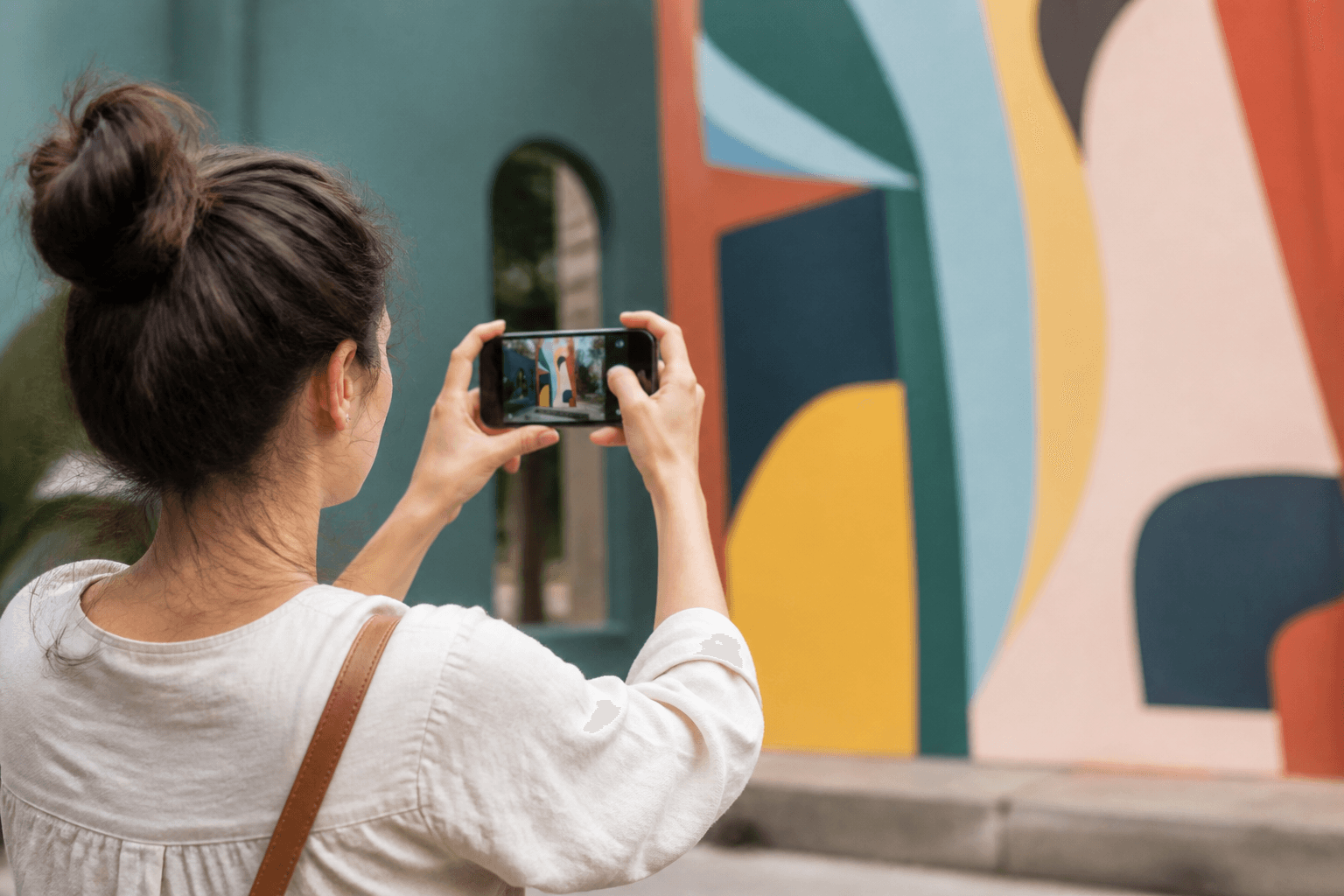
Most brands still treat shareability as a request. Put a hashtag on a poster. Ask customers to tag you. Offer a discount for a story. Then wonder why the feed stays quiet. People do not photograph marketing because you asked. They photograph it because the moment is worth owning.
That distinction matters more than budget. A £50,000 media plan that produces nothing worth a phone camera will underperform a £500 intervention that makes someone stop, smile, and lift their device without being prompted. The camera is not a distribution channel you rent. It is a vote of attention people cast when the world briefly looks better through their lens than through their eyes alone.
This piece is about designing for that vote: photogenic moments, social proof by choice, and the quiet craft of making campaigns people choose to document. Related context: why the best marketing doesn’t always start behind a screen and why people rarely share advertisements-they share stories.
A photograph is not just a memory. It is identity work. When someone posts an image, they are saying something about who they are, what they notice, and which rooms they want to appear to inhabit. Brands that understand this stop designing for impressions and start designing for self-expression.
Most advertising fails all five. It is neither status-conferring nor belonging-coded. It is not useful. It is not delightful. And it rarely proves anything the customer cares about. So the phone stays in the pocket. That is not a “content problem.” It is a design-of-moment problem.
I use a simple five-part test when reviewing real-world or hybrid campaigns. If a concept fails two or more layers, I send it back-regardless of how clever the copy is.
| Layer | Question | Pass signal |
|---|---|---|
| Readable at arm’s length | Can a stranger understand the idea from a phone photo? | One clear subject, one clear idea |
| Human scale | Does a person look good (or interesting) beside it? | Natural pose points, not awkward props |
| Identity fit | Would posting this say something flattering about the sharer? | Taste, wit, curiosity, or care-not free stuff desperation |
| Light and contrast | Does it survive bad phone cameras and grey weather? | Strong silhouette, colour, or typography |
| Story residue | Does the photo still make sense without the brand explanation? | Caption-optional clarity |
Notice what is missing: “logo size,” “CTA visibility,” and “hashtag prominence.” Those are secondary. If the moment is right, the brand can be quiet and still travel. If the moment is wrong, a logo the size of a bus will not save you.

Creative reviews still happen on large screens in bright rooms. Reality happens on small screens in uneven light, with a stranger half in frame and a bin bag in the background. Design for the second environment or you are designing fiction.
People crop. Algorithms crop. Stories crop harder. Put the idea in the centre third. Avoid delicate edge details. Prefer bold shapes, short lines, and one dominant colour relationship. If your concept requires reading six lines of body copy to “get it,” it will not travel as a photograph.
Photogenic marketing often includes an implied stage: a footprint, a mirror, a framed view, a seat that faces the best angle, a doorway that turns the passer-by into a silhouette. You are not forcing a pose. You are making the good photo the path of least resistance.
Asking people to post is the least elegant form of permission. Better forms: a surprising view, a temporary exclusivity (“only this week”), a clever mirror of local culture, or a gift that looks better shared than described. The ask, if any, should feel like an invitation to finish a joke-not like unpaid labour for your brand.
Bribed social proof looks busy and feels empty. Chosen social proof looks quieter and converts better because the audience can smell authenticity-even if they cannot name it. A queue for free coffee is not the same signal as someone photographing your window because the typography made them laugh.
I am not puritanical about incentives. They have a place for community programmes and loyalty loops. But if your only path to photographs is a discount, you have not designed a moment-you have rented one. Rented moments evaporate when the coupon ends.
Think of the installations people photograph without being told: colour-blocked staircases, witty bus-shelter copy that completes itself when a person stands in frame, product displays that create a tunnel of light, packaging that looks like an object of desire on a kitchen table. The common thread is not “cool.” It is legibility plus identity plus a human-scale stage.
Contrast that with the classic failure: a busy mural of product features, a QR code larger than the idea, and a brand slogan that requires the campaign name to decode. It may win an internal award. It will lose to a grey sky and a tired phone camera.
For a related argument about physical presence in a digital age, see why the internet still needs the real world. For how street work should continue online, see a good street campaign doesn’t end on the street.
Vanity metrics will lie to you here. Impressions do not equal photographs. Photographs do not equal affinity. Affinity does not equal revenue-unless you design the bridge. Track a short chain:
If you need a sharper diagnostic before spending, use before you spend £10,000 on marketing, ask these five questions. If you are early and tempted to buy reach instead of designing moments, read what founders actually need isn’t more marketing.
For the psychology of sharing and social currency, Jonah Berger’s research on why things catch on remains useful. For attention and design clarity, Nielsen Norman Group is still the sober adult in the room. For out-of-home craft and environment, look at how Transport for London’s design standards treat legibility in real public space-not as a moodboard, as an operating constraint.
No. B2B still has humans with phones. A conference booth, a packaging unboxing, a founder-led demo space, or a clever data visualisation can be photogenic. The identities differ-competence, foresight, craft-but the mechanics do not.
Then do not photograph the product. Photograph the outcome, the tension you resolve, or the world you create around the product. Boring products often have interesting consequences.
Softly, after the moment works. A small cue is fine. A desperate plea is a confession that the design failed.
Tie every moment to a true brand promise. Gimmicks travel once. Coherent moments compound. If it could be any brand with a sticker swap, cut it.
Going viral is a lottery ticket people keep buying with other people’s money. Designing something worth photographing is a craft. It is slower in the briefing room and faster in the world. It respects that attention is not extracted-it is offered when the moment earns it.
At nau, I treat photogenic design as part of the same system as product narrative and web experience: one promise, many surfaces, no begging. If your next campaign needs a loud ask to travel, the idea is not finished.
Want to design a campaign people photograph without being asked?
Talk about your next campaignContinue reading
A complementary essay from the same thread.
Swipe left for next, right for previous.
Up next · Content
Creative marketing frameworks for founders who can't outspend the competition.
Read essay →Let the right audience find you, with 10 videos only. That's the progress we build together.

Stefani Dimitrova
Organic GTM & Product Storyteller