Content · July 31, 2026

The QR code was never the problem. The story was.

Why context matters far more than technology.

The QR code was never the problem. The story was.

Every few years the industry rediscovers QR codes, declares them back, then blames the technology when campaigns flop. That is a category error. The QR code is a door. Doors are not interesting. What is on either side of the door-and why someone would walk through-is the entire craft.

I have seen QR codes work beautifully on a muddy festival fence and fail completely on a polished tube poster. Same technology. Different context. Different promise. Different aftermath. If your scan rates are embarrassing, do not start with a vendor conversation about dynamic codes and pixel tracking. Start with why a busy human should interrupt their day for you.

This piece is about bridge design: promise before scan, placement with manners, and destinations that repay the effort. It sits beside why the internet still needs the real world and a good street campaign doesn’t end on the street.

What a QR code actually is (and is not)

A QR code is a deferred click. It moves someone from a physical context into a digital one with more friction than a thumb-tap on a phone they are already holding. That friction is not fatal. It is a filter. Filters are useful when the reward is clear. They are fatal when the reward is “learn more.”

  • It is not a creative idea.
  • It is not a strategy.
  • It is not proof of innovation.
  • It is a bridge between two moments-if both moments deserve each other.

The promise → scan → payoff bridge

I evaluate QR usage with a three-part bridge. Fail any span and the whole thing collapses-usually onto a slow landing page that looks like it was built for desktop in 2019.

SpanJobCommon failure
PromiseTell them what they get before they unlock their phone“Scan for more” / logo-only codes
ScanMake the physical act easy and socially comfortableTiny codes, glare, awkward height, queues
PayoffDeliver the promised value in under five secondsHomepage dump, app-store maze, lead-form ambush

Promise is the most neglected. Marketers obsess over code aesthetics and UTM hygiene while putting nothing human-readable next to the square. Strangers do not scan mysteries unless the mystery is the product-and even then, only if the culture around it supports play.

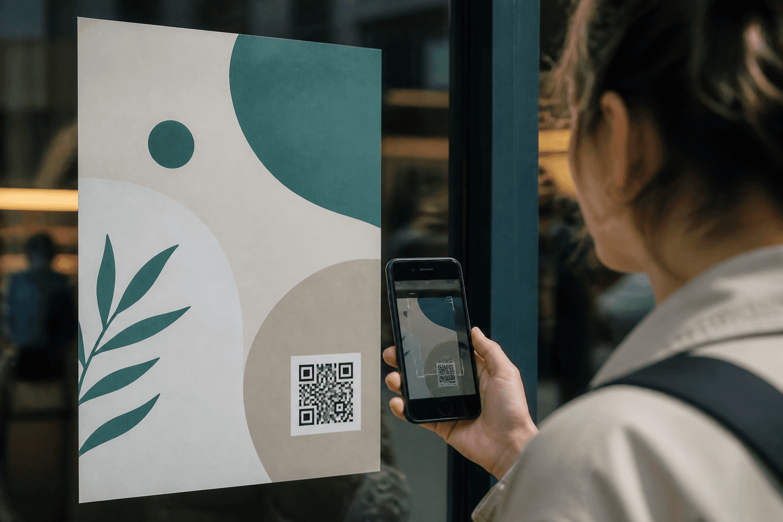
Physical poster with a clear promise beside a QR code rather than a code alone

Context is the strategist

1. Time context

A commute scan must be faster than a gallery scan. A queue can tolerate a slightly richer payoff than a pavement dash. Design for the seconds people actually have-not the seconds your analytics dashboard wishes they had.

2. Social context

People avoid looking foolish. Asking someone to stand in the middle of a busy pavement, unlock their phone, open a camera, and aim at a 3cm code is a social ask. Raise the code. Enlarge it. Give them a reason that feels clever rather than obedient. Privacy matters too: do not force a performance in a space where people feel watched.

3. Intent context

A menu QR at a table has high intent. A billboard QR on a motorway has near-zero intent and a non-trivial crash risk. Intent is not a vibe. It is a physical fact about what people are doing with their hands and eyes.

Misuse patterns I keep seeing

  1. The orphan code: no promise, no brand story, just a square and hope.
  2. The homework code: lands on a PDF or a 12-field form.
  3. The vanity code: exists because a stakeholder saw QR codes “working” elsewhere.
  4. The duplicate destination: every code goes to the homepage, destroying learning.
  5. The desktop destination: tiny tap targets, pop-ups, cookie banners eating the payoff.

None of these are technology problems. They are manners problems. You have invited someone across a bridge and then forgotten to meet them.

Designing the payoff like a product surface

Treat the post-scan page as a first-run experience. One job. One primary action. Proof adjacent to the claim. Fast load. No bait-and-switch. If the poster promised a map, open the map. If it promised a sample request, show a three-field form-not your company’s life story.

  • Unique URL per placement so you can learn which contexts convert.
  • Mobile-first layout tested on mid-range Android in sunlight.
  • Offline fallback where relevant (festival wifi is a rumour).
  • A thank-you state that can be screenshotted-people like receipts.

This is the same discipline as web conversion work-see why beautiful websites don’t always convert and why startup websites fail in the first 10 seconds-applied to a colder start. The user did not search for you. They interrupted themselves for you. Repay that.

When QR is the wrong tool

Sometimes the honest answer is: do not use one. If the physical piece can carry the whole message, let it. If SMS shortlinks or near-field alternatives fit the environment better, use them. If the audience is older and less camera-fluent in that context, design for them instead of lecturing them about “how easy QR is now.” Technology worship is not strategy.

For broader thinking on physical-digital systems, read why the best marketing doesn’t always start behind a screen and your city is the most underrated marketing channel.

A one-day QR audit

  1. Inventory every live code and its destination.
  2. Rewrite the on-site promise in six words or fewer.
  3. Check size, height, contrast, and glare at the real location.
  4. Time the path from scan to promised value on a mid-range phone.
  5. Kill or redirect any code that dumps to a generic homepage.
  6. Add one metric that matters (completion of the promised action)-not just scans.

Useful references

For interaction clarity under real-world constraints, Nielsen Norman Group remains grounding. For mobile performance as part of trust, see Core Web Vitals. For accessibility and inclusive design of public information, the GOV.UK Design System is a masterclass in not making citizens suffer for your cleverness.

Are dynamic QR codes worth it?

Yes for iteration and safety (you can change destinations). No as a substitute for a clear promise. Dynamic plumbing does not fix a boring bridge.

What scan rate should we expect?

It depends entirely on context and promise. Compare like-for-like placements. A single industry benchmark without context is mostly fiction.

Should every piece of OOH include a QR?

No. Include one when the digital layer adds a value the physical layer cannot. Otherwise you are adding friction for the sake of looking modern.

How do we attribute revenue?

Unique destinations, simple conversion events, and honesty about assist vs last-click. Do not torture the model until it flatters the poster.

Fix the bridge, not the square

The QR code was never the problem. Ambiguous promises, rude placements, and disappointing destinations were. Get those right and the square becomes invisible in the best way: people use it without thinking about the technology at all.

At nau, I treat QR-and any physical-to-digital handoff-as product design in public. Context first. Promise second. Payoff third. Tracking last. If you reverse that order, you get dashboards full of scans and customers full of regret.

Have a physical-to-digital bridge that isn’t earning its keep?

Let’s redesign the context

Let the right audience find you, with 10 videos only. That's the progress we build together.

Stefani Dimitrova

Stefani Dimitrova

Organic GTM & Product Storyteller